

By Kevin Yi
Most early-stage startups know they need a video. The landing page converts better with one, investors ask “is there a demo?”, and every social platform now favours video over text. Then the founders get a quote from an animation studio, look at the runway, and the video goes onto the “after the next round” list.
It doesn’t have to. A single well-written explainer, made cheaply and planned for reuse, can cover most of what a pre-seed or seed company needs. This is how to plan one video so it does five jobs instead of one.
Key takeaways
- A 60–90 second explainer (about 150–220 spoken words) can serve your landing page, social channels, launch day, onboarding and investor updates.
- Write and time the script before touching any tool; it is the cheapest place to fix the video.
- Make the vertical version as its own render instead of cropping the horizontal one.
- Use animation where your product is abstract or not yet filmable; use real footage for UI demos, hardware and testimonials.
Why one explainer is worth the effort
The demand is well documented. In Wyzowl’s State of Video Marketing 2026 survey, 96% of consumers said they have watched an explainer video to learn about a product or service, 85% said a video has convinced them to buy, and 63% said a short video is how they would most like to learn about a new product. On the marketing side, 93% of video marketers said video increased user understanding of their product and 85% said it generated leads. Explainer videos were the second most-made video type in the survey (68%), just behind social media videos (69%).
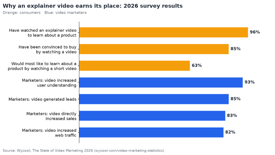
Source: Wyzowl, The State of Video Marketing 2026.
For a startup, the point isn’t that video is popular. It’s that one explainer answers the same question (“what does this do, and is it for me?”) for every audience you have.
Start with the script, not the tool
The script is where startup videos succeed or fail, and it costs nothing but time. A 60–90 second explainer has room for about 150–220 spoken words, which forces you to choose. A structure that works for most B2B and consumer products:
- The problem, in the customer’s words (10–15 seconds). Not “inefficient workflows” but “you spend Friday afternoon copying numbers between three spreadsheets.”
- Who it’s for (5 seconds). One sentence that lets the right viewer recognise themselves.
- How it works (30–40 seconds). Three steps, no more. If it takes six steps to explain, the video is not the problem.
- Proof (10 seconds). A number you can stand behind, a customer type, or a before/after.
- One call to action (5 seconds). Book a demo, join the waitlist or start a trial. Pick one.
Read it aloud with a timer before you produce anything. Cutting a line at this stage is free; cutting it after the scenes are drawn is not.
Make the master version
Animated explainers suit startups because the product often doesn’t exist in a filmable form yet, and because a cartoon can show an abstract problem (data scattered everywhere, a team waiting on one person) more clearly than stock footage.
AI story video tools have made this affordable. In ToonBee AI, for example, you paste the finished script and the narration follows it word for word; the tool splits it into scenes, draws each one in the art style you pick and keeps the same characters throughout. You review every scene picture before anything is animated, redraw the ones that miss, and then choose whether all scenes move or only some. Each step shows its credit cost before you confirm, which matters when every dollar is tracked.
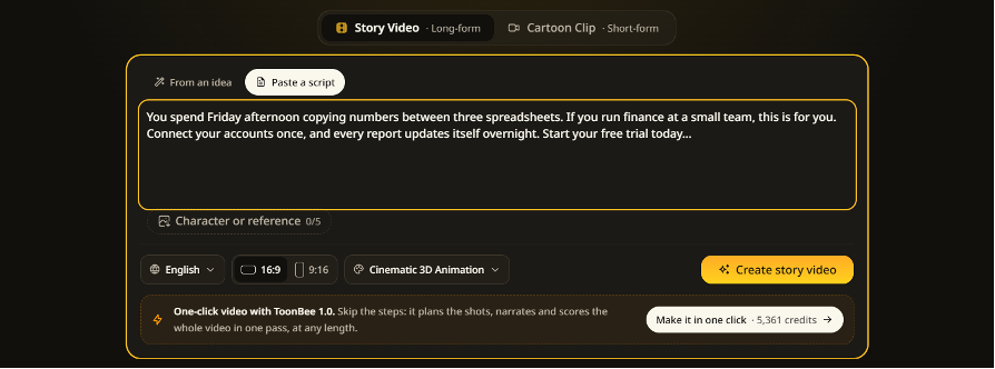
Pasting a finished explainer script: the narration follows the text word for word.
A few choices make the master easier to reuse later:
- Pick a style that matches your brand and stick to it. Flat vector and whiteboard looks read as “software”; watercolor or children’s-book illustration reads as consumer and friendly.
- Give your customer a face. A single recurring character, the person with the problem, becomes a mascot you can bring back in every future video.
- Leave clean pauses between lines. Each pause is a future cut point.
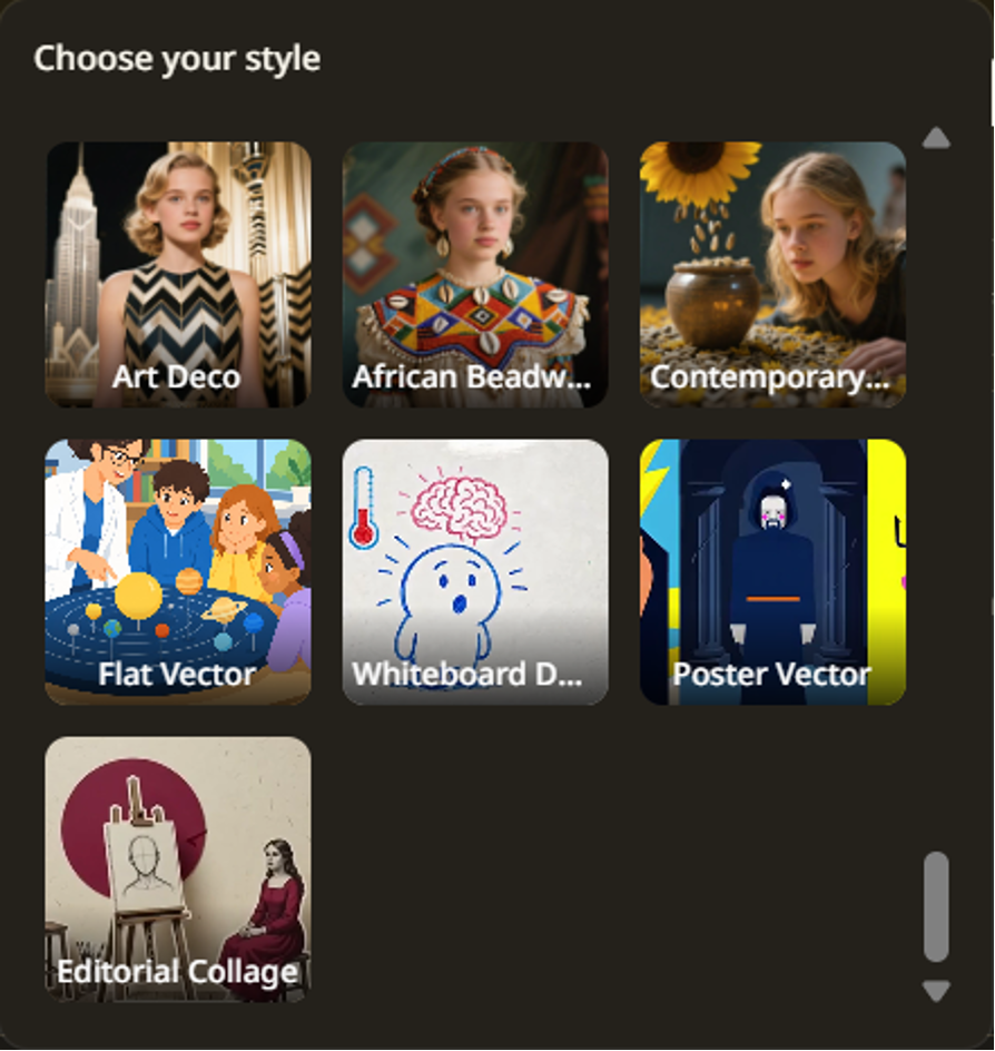
Flat vector and whiteboard looks are a common fit for software explainers.
Where cartoons are the wrong choice: if your product’s main selling point is its interface, record the screen. If you are a hardware company, film the device. And customer testimonials should always be real people on camera.
Job 1: The landing page video
Put the full 16:9 version above the fold or directly under the headline. Two practical notes:
- Many visitors will never press play. Make the first frame a scene that explains something on its own, such as the customer facing the problem.
- Autoplay on landing pages usually has to be muted, so turn captions on. A narrated explainer without captions is a silent slideshow to half your visitors.
Job 2: A vertical cut for social
Don’t crop the horizontal video to 9:16; you lose most of the frame, often including the character’s face. Make the vertical version as its own render, composed for a tall frame, with a shorter script: the problem, the single most surprising step of how it works, and the call to action. Thirty seconds is plenty.
Because the characters are anchored to the same reference pictures, the vertical cut looks like the same story rather than a different ad.
Job 3: Launch-day clips
Launch days (Product Hunt, a funding announcement, a big feature release) need a stream of small posts across LinkedIn, X and community channels. Pull three or four 10–15 second moments from the master:
- the problem moment,
- the “aha” step,
- the proof line.
Each clip should make sense with no context. Post them across the launch day rather than all at once, and pin the full video at the top of your launch post.
Job 4: Onboarding and help-centre videos
The same character and style can carry your onboarding. Write a 30–45 second script for each key feature or first-week task: “connect your first data source”, “invite your team”. New users recognise the character from the landing page, which makes the product feel consistent from first visit to first login.
These short videos also cut support tickets. Put each one at the top of the matching help article.
Job 5: Investor updates and pitch follow-ups
Investors see hundreds of decks. A 60-second explainer linked in the follow-up email gives a partner who wasn’t in the meeting a way to understand the product in a minute. In monthly investor updates, a 20-second clip of a new feature is more likely to be watched than a paragraph describing it.
Keep this honest: an explainer shows how the product is meant to work. If a feature is still on the roadmap, say so in the email, not just in the video.
What it costs, roughly
Budget in time first. Expect a day to write and tighten the script, and an afternoon to produce and review the master. The vertical cut and onboarding videos reuse the same characters, so each takes an hour or two.
In money, AI tools have changed the maths. Studio explainers are commonly quoted in the thousands of dollars per finished minute. With an AI story tool you pay in credits for pictures, narration and animation, and you decide how much to animate: still pictures with a little motion on the key scenes cost a fraction of a fully animated version and often work just as well on a landing page. ToonBee, for instance, runs in the browser with nothing to install, includes narration, captions, music and both 16:9 and 9:16 in the same credits, gives new accounts 100 free credits to try it, and offers one-time credit packs if you’d rather not take on another subscription.
A one-week plan
| Day | Task |
| Monday | Write and time the script; get two customers to read it |
| Tuesday | Produce the 16:9 master; review every scene |
| Wednesday | Landing page update with captions on |
| Thursday | 9:16 cut and three launch clips |
| Friday | First two onboarding videos; send the link in your investor update |
Common mistakes
- Explaining the company instead of the problem. Viewers care about their Friday afternoon, not your founding story.
- Too many features. Three steps. Everything else goes in the onboarding videos.
- Changing the style every video. Consistency is what makes a small startup look established.
- Never updating it. When positioning changes after customer interviews, change the script. A video that describes last quarter’s pivot does more harm than no video.
FAQ
How long should a startup explainer video be?
60 to 90 seconds for the main version, which is roughly 150–220 spoken words. In Wyzowl’s 2026 survey, 71% of marketers said videos between 30 seconds and 2 minutes are the most effective. Cut a 30-second version for social.
Should an early-stage startup use animation or live action?
Animation when the product is abstract, still in development or software-based without a polished interface. Live action or screen recording when the interface itself is the selling point, for hardware, and always for customer testimonials.
Can I reuse the same explainer for investors?
Yes. Link it in follow-up emails and investor updates, and be explicit about which features are live and which are planned.
One video, planned properly, can serve the landing page, social, launch day, onboarding and investors. Write it once, carefully, and let it work for you.
Kevin Yi builds AI video tools, including ToonBee AI.

Author: Kossi Adzo
Kossi Adzo is the editor and author of Startup.info. He is software engineer. Innovation, Businesses and companies are his passion. He filled several patents in IT & Communication technologies. He manages the technical operations at Startup.info.