
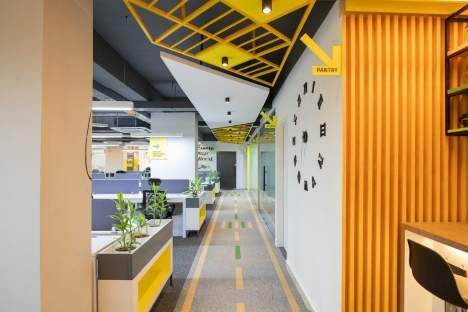
Picture a founder in a bare 120-square-metre unit, a tape measure reaching only two walls, while the agent mentions that another team wants the space by Friday. Twelve desks, a meeting room and a kitchenette all need a home. Her only photo is of the window. When the lease draft arrives, nobody can say whether the layout works.
Landlord floor plans show walls but not how a room feels, and paper sketches get slow once you want to compare several layouts. Ai interior design gives you a way to test those layouts on your own photos, using Bare-Shell Design to keep the room’s structure while furniture, lighting and decor are added in a chosen style. Below: how to photograph the space, how to score three layouts side by side, and where a professional has to take over.
Photograph the Empty Space Like a Surveyor
A generated image can only be as accurate as the photo behind it, so settle the photos before the style. Shoot at roughly chest height with the camera level, so vertical lines stay vertical. Stand in each corner and shoot toward the opposite one, then add a wide shot of every entrance. Switch on all lights and open the blinds, because uneven light produces muddy results. Take one extra frame with a colleague standing against a wall; a person of known height gives you a scale reference later. Shoot every view in one session, so daylight stays consistent across the set.
Alongside the photos, record what a picture cannot show: ceiling height, window sill height, door swing, outlet positions and any fixed columns. Save these in a note named after the photo. When a generated image looks tight or generous, check it against these numbers instead of trusting your eye.
Write a Brief That Rules Options Out
Before generating anything, decide what the space has to do. Headcount, meeting frequency, client visits and noise tolerance narrow the field quickly. A brief reading “twelve desks, one room seating six, a phone booth, nothing blocking the window” yields layouts you can compare. A brief reading “modern and creative” yields twelve moods and no decision.
- Fixed needs: desks, one meeting room, storage, a quiet call spot.
- Flexible needs: lounge corner, second meeting room, plant wall.
- Hard limits: budget ceiling, lease length, landlord rules on alterations.
- Style words: no more than three, such as warm, quiet or timber.
Write the brief before looking at any image, and share it with everyone who will use the office. Whether the quiet call spot is fixed or flexible is easier to settle in a document than in front of a half-finished layout.
Turn Three Layouts into Comparable Visuals
Pick three layouts that differ in structure rather than decoration: open plan, a central meeting room, and a split plan with a quiet zone. For each, run the same empty-room photo through ai room design tools that offer Bare-Shell Design, and reuse one style reference so only the layout changes. Use Furniture Placement to mark where desks or storage sit, and Targeted Material Swap to compare flooring without touching the walls.
If a version drifts, say a window has grown or a column has vanished, go back to an earlier version on the canvas of the visual design tool rather than patching it. Check the image against your measurement note. Discard the drifted image; do not bend your measurements to fit it.
Name each file by layout and version, such as split-plan-v2, and keep the style reference in the same note. A week later you will know which differences came from the layout and which came from a changed reference.
Score Each Option Against the Same Criteria
A good render makes every layout look finished, so score them on paper before anyone falls for one. Rate each layout from 1 to 5 on the items below, and have two colleagues score separately before anyone discusses.
- Circulation: can two people pass at the busiest desk cluster?
- Light: does anyone work with their back to the only window?
- Noise: how far is the meeting room from the focus desks?
- Growth: can four more desks fit without moving the kitchenette?
- Alteration load: how many walls, outlets or fixtures must change?
To test furniture proportion, print the image and pick a desk whose real width you know, say 1.4 metres. Count how many desk widths fit along a wall in the image and compare that with the wall length in your note. If the two disagree by more than one desk, do not use that render for planning.
Take a hypothetical six-person studio comparing open plan against a split layout. The open plan scores high on light and low on noise, while the split plan reverses that. Side by side on the same photo, the trade-off turns concrete: the team can ask whether a glazed meeting room would keep the daylight and cut the noise.
What Still Needs a Professional
Generated images are concept visuals, not drawings. They cannot confirm that a wall may be moved, that sprinklers and ventilation suit your layout, or that the plan meets local fire and accessibility rules. Those checks belong to a licensed designer, architect or contractor, and often to the building manager. Bring your preferred concept and measurement note so they start from your intent, and expect them to change it.
Label images when you share them. A furnished picture of a vacant unit is a proposal, not its current state. Caption it plainly, for example “Digital concept: furniture not in the unit”, keep the original photo beside it, and follow any disclosure rules from the landlord, broker or listing platform if the space is being marketed.
What to Take to the Landlord Meeting
Email the landlord three questions from your scorecard before the meeting: which walls can move, who pays for extra outlets, and how long the fit-out period runs. Attach the original photos, and caption any concept image as a digital concept so nobody mistakes it for the unit as it stands today.

Author: Kokou Adzo
Kokou Adzo is the editor and author of Startup.info. He is passionate about business and tech, and brings you the latest Startup news and information. He graduated from university of Siena (Italy) and Rennes (France) in Communications and Political Science with a Master's Degree. He manages the editorial operations at Startup.info.